Preview
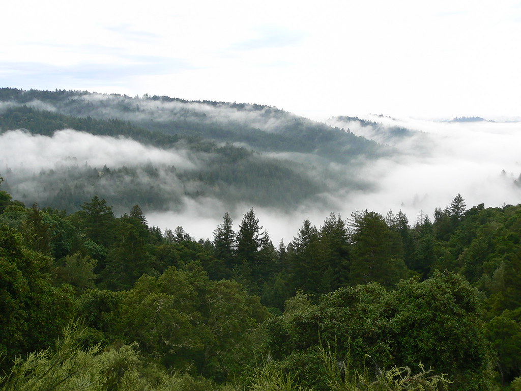
a bicycle for the mind.
santa cruz mountains, 7:00 am.Installation
Install the local ghost-kit source bundle while the registry runs at localhost:3110. It contains this component and its source dependencies. Prepare the local registry first so token dependencies also resolve locally.
Basic usage
Use the exported component in the composition shown above. Keep labels, data, and callbacks in the consuming application.
Structure
Examples
Variants
Postcard only
The card flips when you select it. It has no segmented face control and no autoplay.
I'm Steve.
I work nights at a video game company. By day, my friend and I build a computer in a garage.
Computers are messy kits for hobbyists. We want a simple tool for the mind that anyone can use.
We finished our first printed circuit board. Even the hidden parts are laid out perfectly.
We are looking for people who see what this could become. We are building something that matters.
Stay hungry. Stay foolish.
Default postcard
Both faces show their paper surface immediately. The segmented control stays available.
a bicycle for the mind.
santa cruz mountains, 7:00 am.Postcard with progress background
The active face fills from left to right. At the end of the cycle, the postcard changes face and starts again.
I'm Steve.
I work nights at a video game company. By day, my friend and I build a computer in a garage.
Computers are messy kits for hobbyists. We want a simple tool for the mind that anyone can use.
We finished our first printed circuit board. Even the hidden parts are laid out perfectly.
We are looking for people who see what this could become. We are building something that matters.
Stay hungry. Stay foolish.
API reference
| Prop | Type | Default | Description |
|---|---|---|---|
front | PostcardFrontData | undefined | Sets front. | |
back | PostcardBackData | undefined | Sets back. | |
className | string | undefined | Sets class name. | |
variant | PostcardVariant | undefined | Surface treatment. `ghost` starts transparent and gains its background on hover; `primary` is surfaced from the start and darkens on hover. | |
showSwitcher | boolean | undefined | Show the Front/Back segmented switcher. Click-to-flip always works when `interactive`. | |
autoplay | boolean | undefined | Autoplay the active tab's progress and auto-flip at the end of each cycle. | |
autoplayInterval | number | undefined | Length of one autoplay cycle in ms. | |
flipKey | string | undefined | Keyboard key that flips the card (case-insensitive for single characters). | |
defaultFace | CardFace | undefined | Starting face for an uncontrolled card. | |
activeFace | CardFace | undefined | Sets active face. | |
onFaceChange | ((face: CardFace) => void) | undefined | Sets on face change. | |
isExpanded | boolean | undefined | Sets is expanded. | |
onExpandedChange | ((expanded: boolean) => void) | undefined | Sets on expanded change. | |
interactive | boolean | undefined | Sets interactive. |